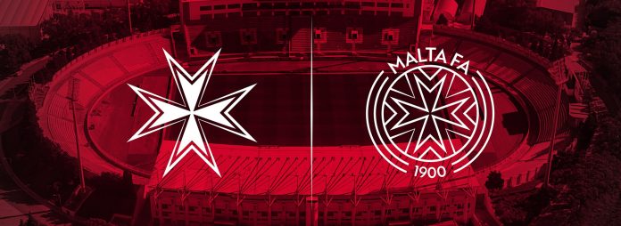
During its General Assembly, the Malta FA has unveiled its rebranding, in line with its strategy for Maltese football 2020-2024 ‘We Can Perform Better’.
The Malta FA’s new visual identity is respectful of its long history and tradition keeping the eight-pointed cross at the heart of both the National Team logo and the corporate logo.
It aspires to reflect the Association’s values: being dynamic, socially responsible, and trustworthy. In terms of positioning, two separate brands are being used: on one side the National Team (male, female, youth teams), and on the other the Malta FA’s corporate identity.
The design process was entrusted to Glasgow-based Frame, who have a solid portfolio of rebranding processes in international football. They were engaged from amongst a number of local and international firms thanks to UEFA’s support through its GROW programme, an initiative to support national associations with expertise and external consultancy.
The National Teams
The essence behind the National Team brand is to reflect competitiveness through hard work. The National Team is a unique identifier that fosters sense of belonging, unity and pride. Hence, the imagery that portrays competitiveness, hard work, bravery and belief in one’s preparation.
The National Teams Logo is made up of an eight pointed cross and an outline which leaves a transparent area in between. With so many versions of the eight-pointed cross used elsewhere, the Malta FA wanted to create a shape that was the best representation of Malta. Each of the arrowheads have been designed to be at a 90-degree angle between each point, creating an accurate cross when combined. The outline has taken inspiration from the Maltese tiles and from elements of the baroque style. Each arrowhead has an outline shape that creates the letter M to represent Malta.
The Association
The essence behind the Association Brand is to use football to build a positive spirit and image of the nation. As stated in its mission, the Malta FA is committed to:
- Growing and improving the game of football and the people in it at all levels
- Encouraging, fostering and facilitating a positive social change to embrace a sporting culture
- Championing national pride and unity as we strive to achieve high standards at all levels and inspire people involved in the game
The eight pointed cross has been positioned at the heart of the Association’s corporate logo too. At each corner of the centre circle, a letter M is created to represent Malta. A more informal inscription ‘Malta FA’ and the foundation year complete the circumference.
The three lines on the outer edges of the logo represent the different categories of the game: male, female, and grassroots. The circular shape and pattern within the centre circle creates a visual representation of a football. The national Team logo itself forms a synergy with the association logo, to reflect the inherent connection between the two.
Source: MFA


